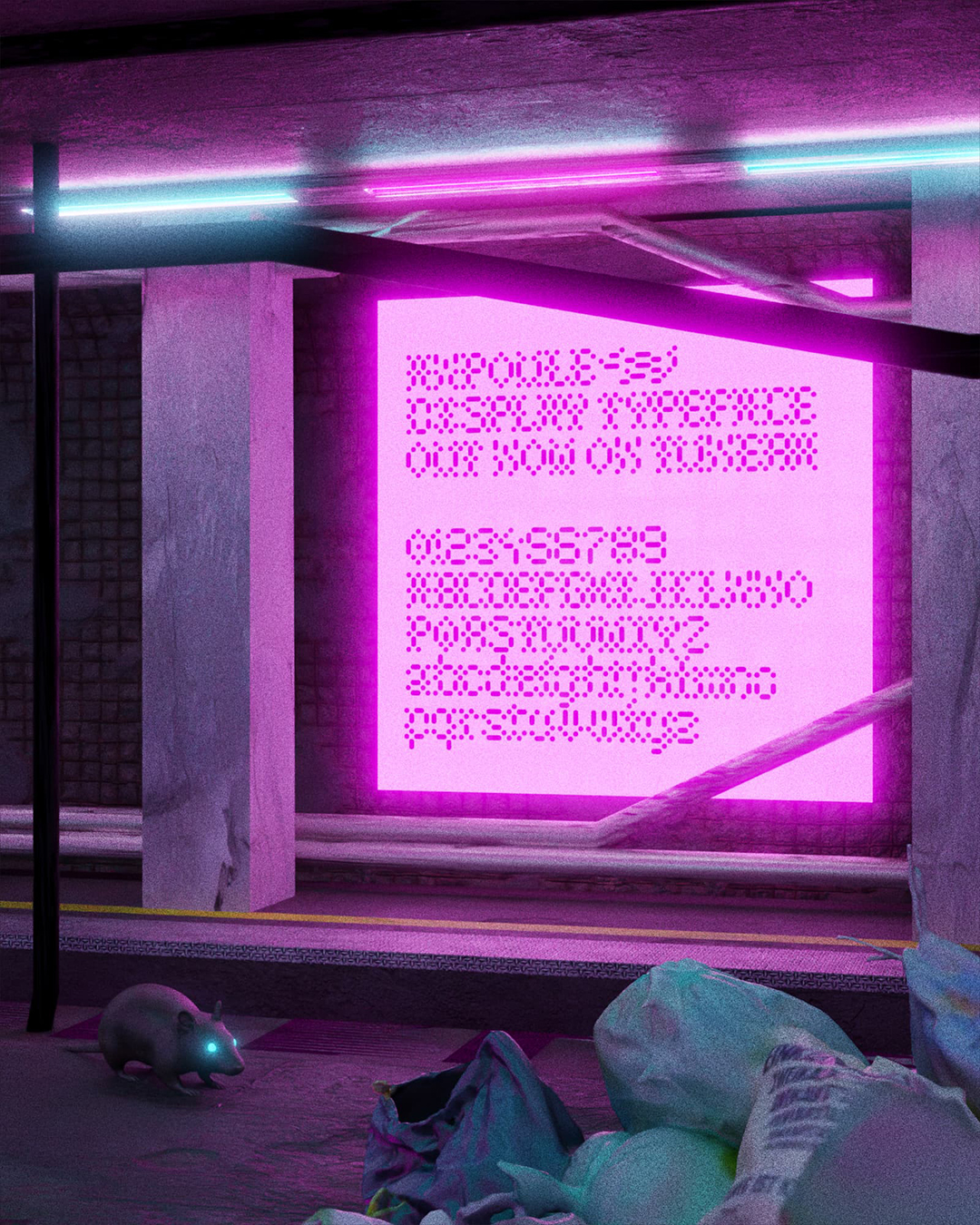
Ampoule
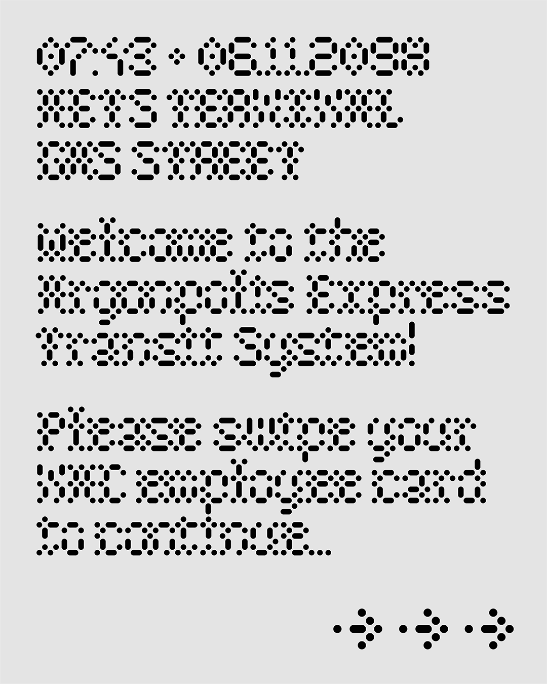
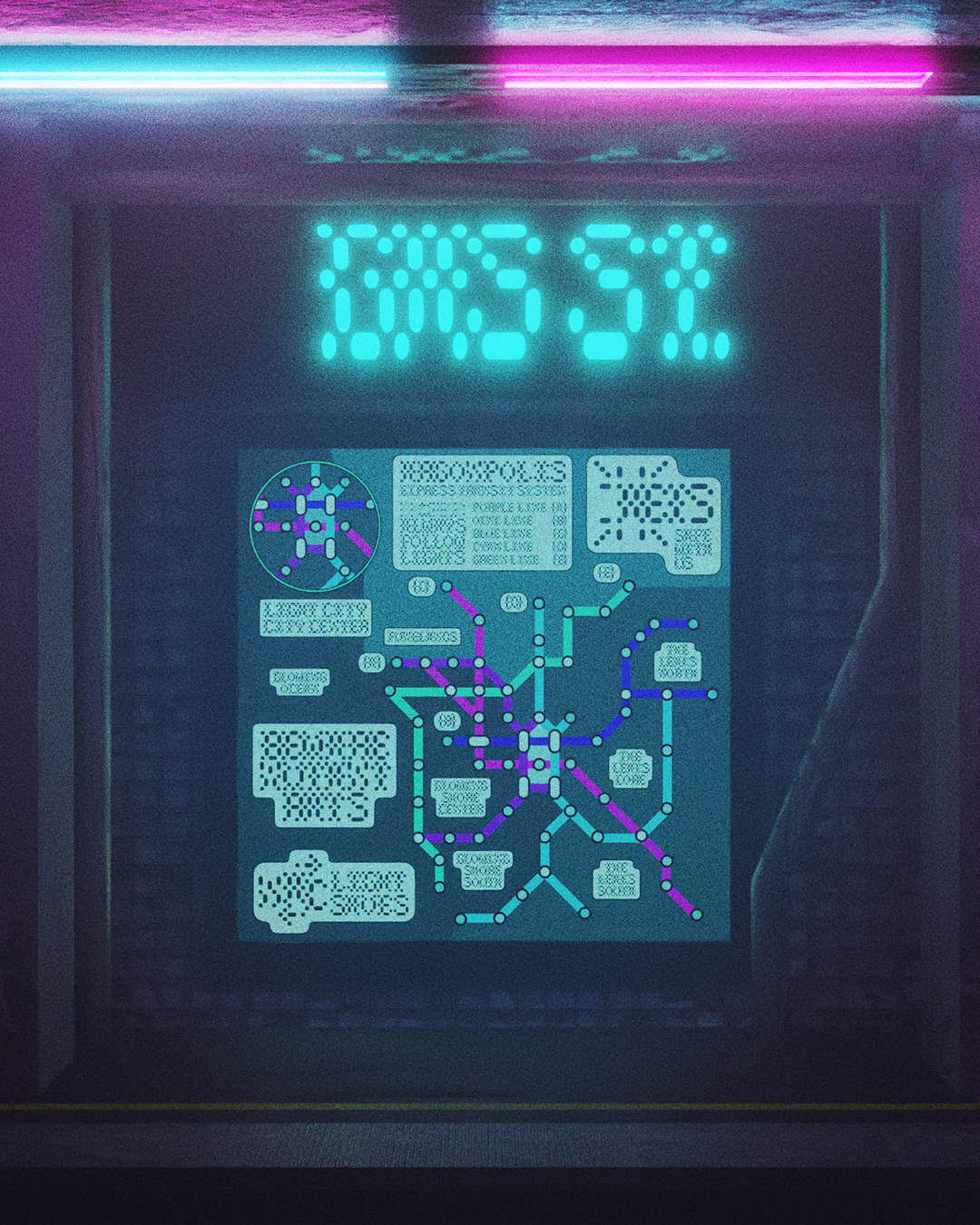
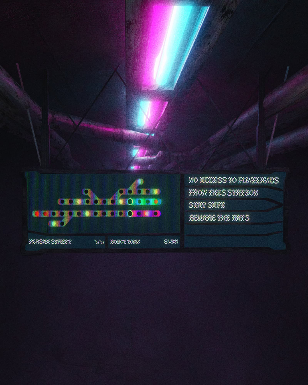
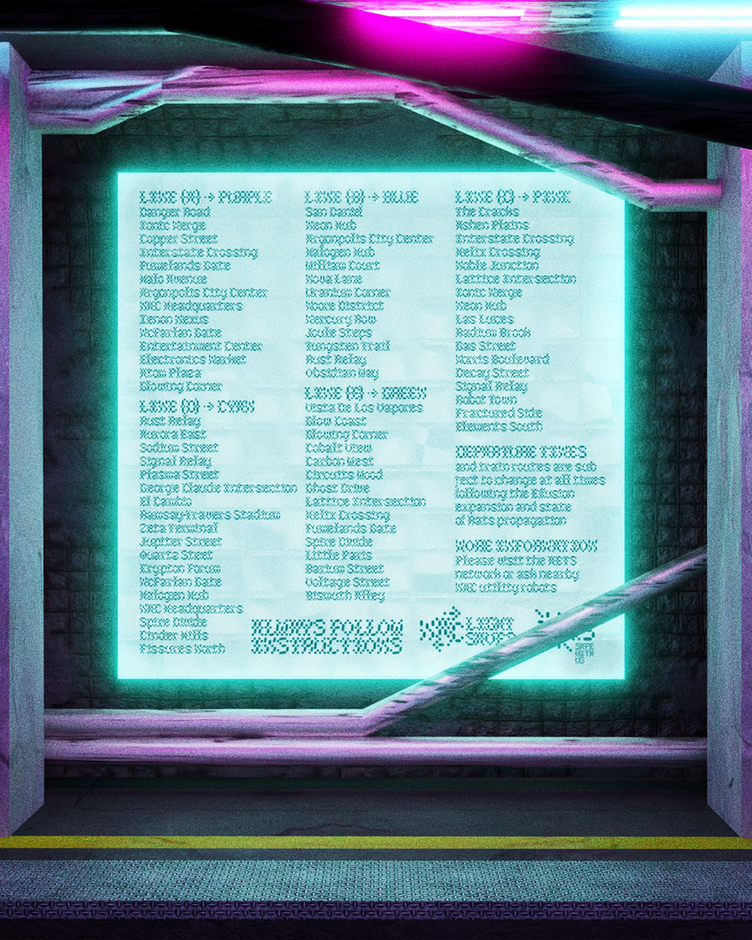
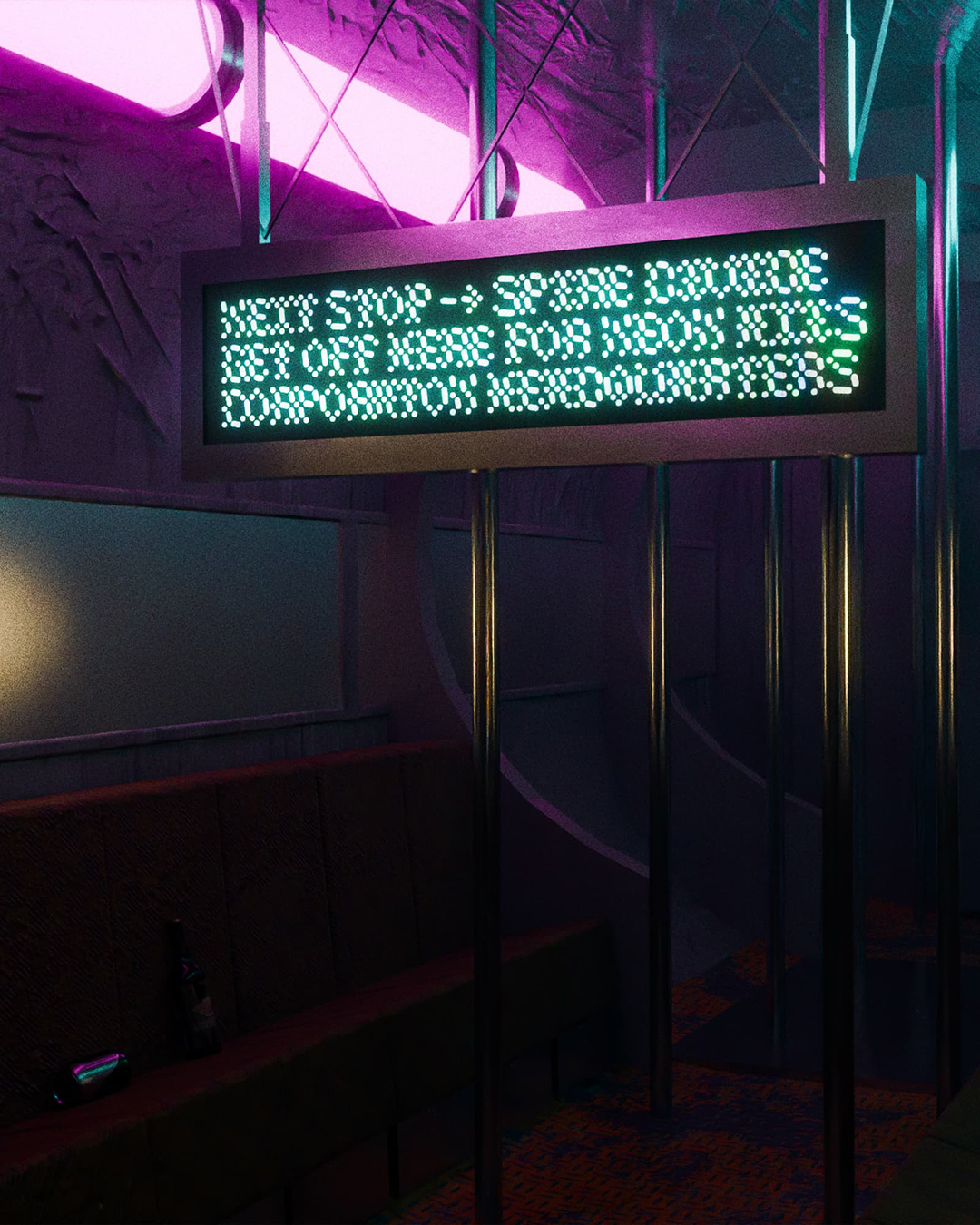
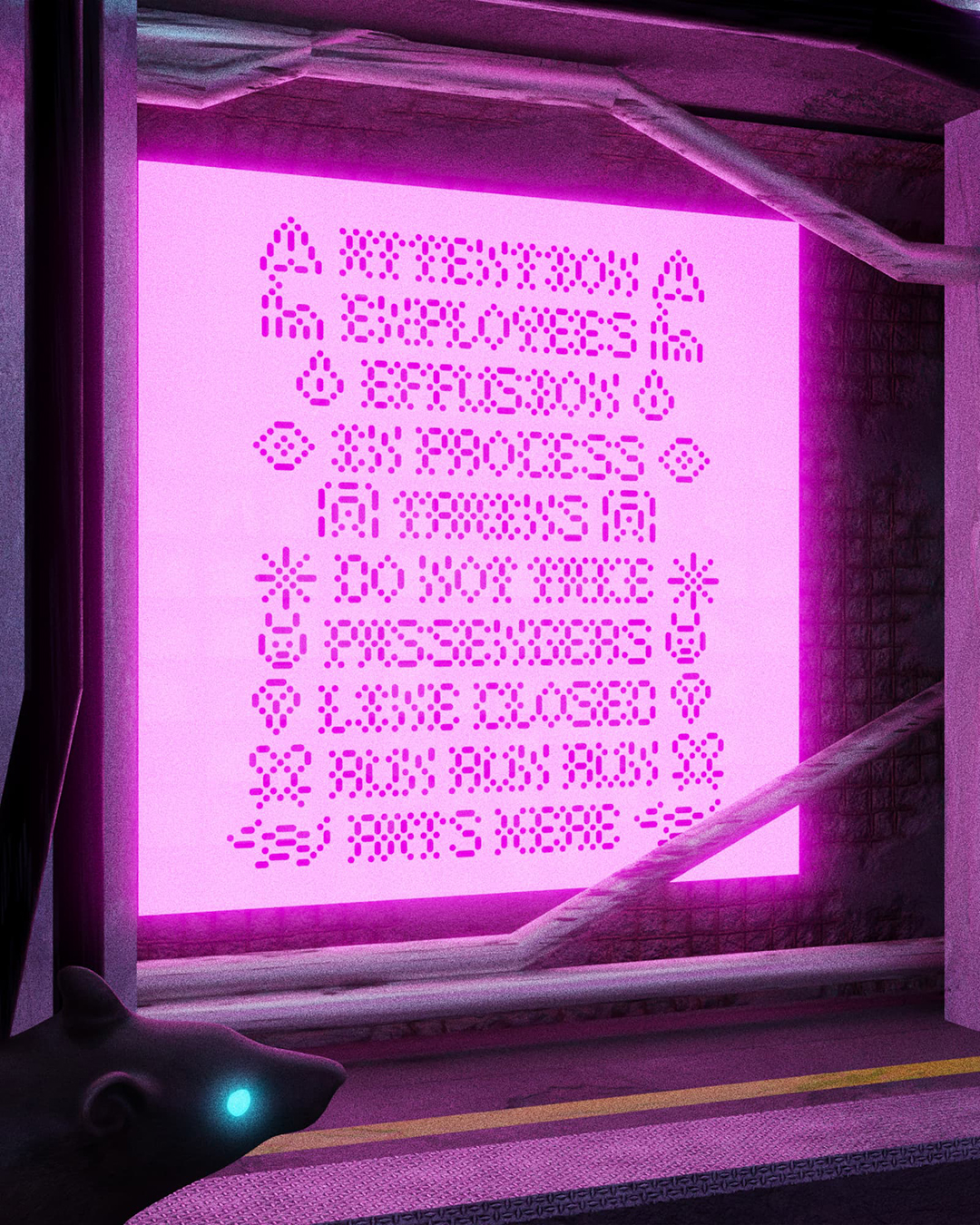
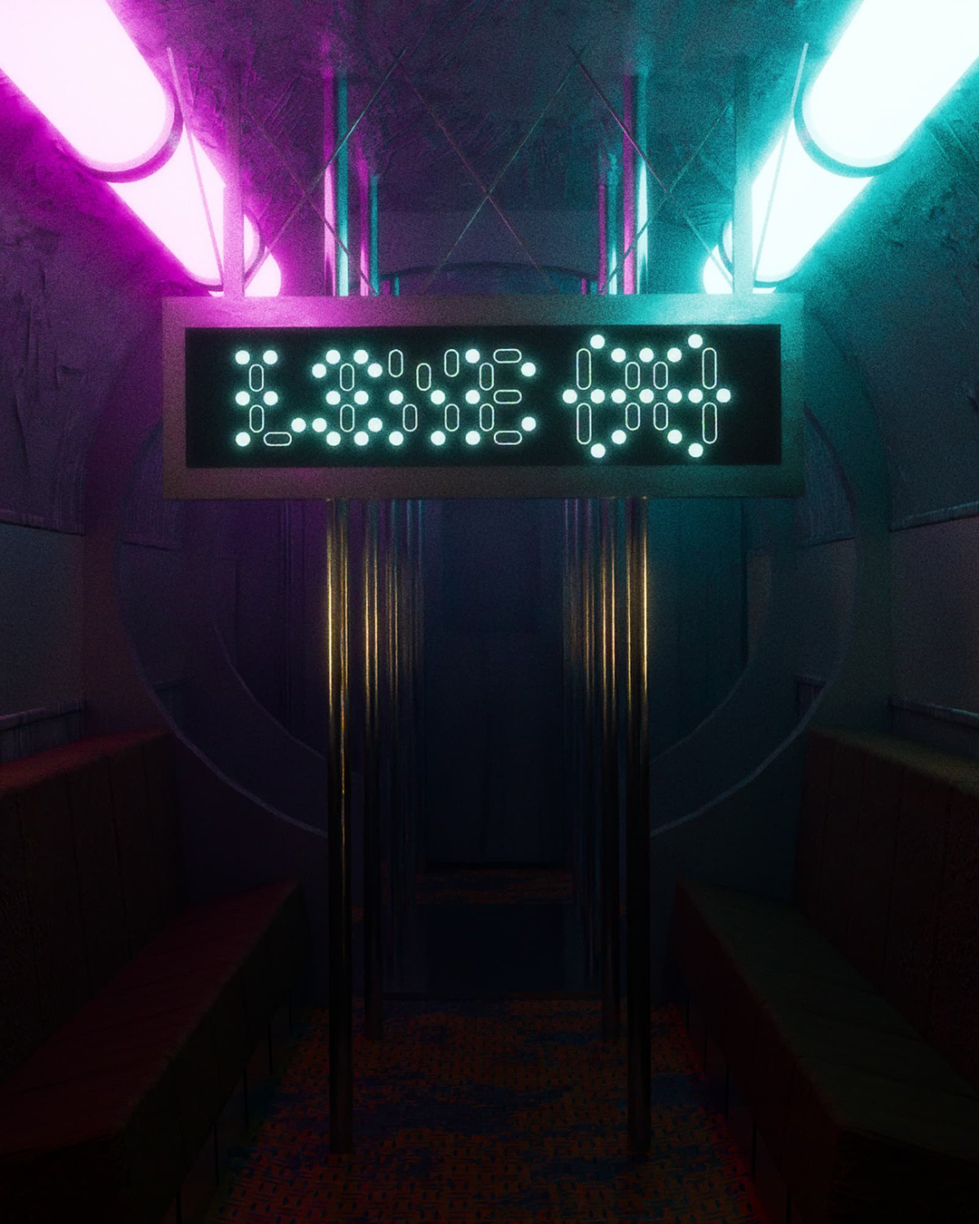
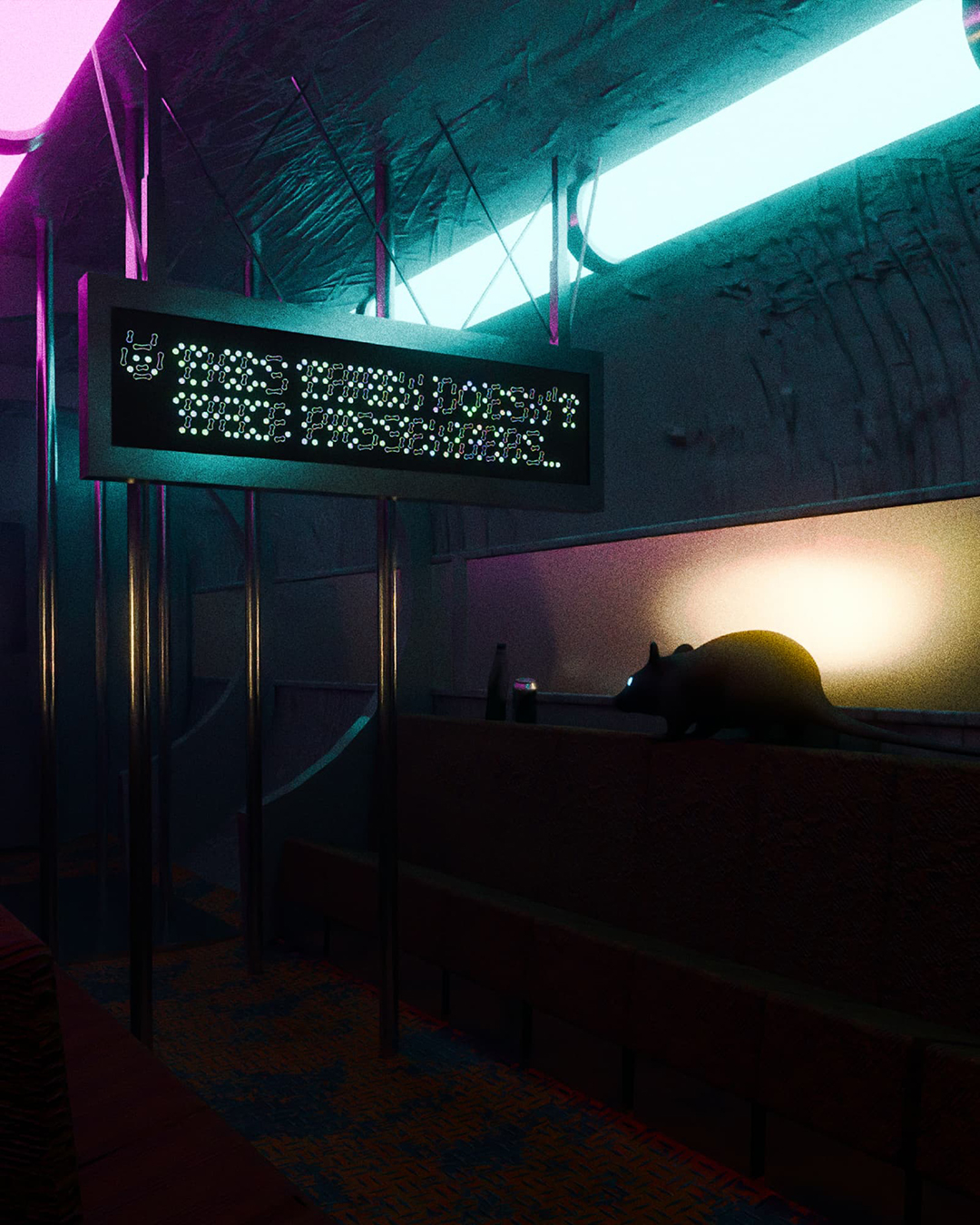
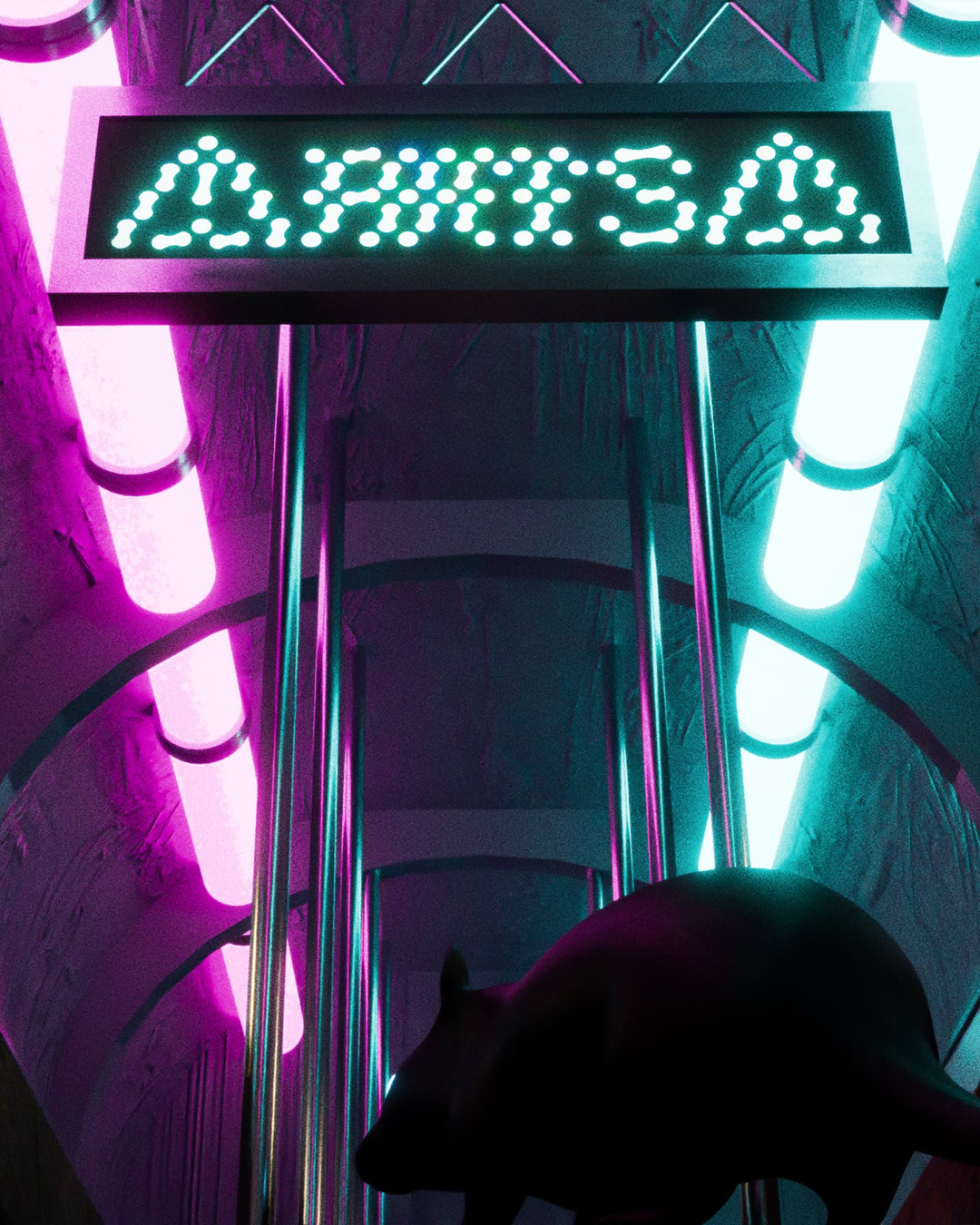
Ampoule is, above all, a display type family, of which the name ("light bulb" in French) and appearance are reminiscent of neon lamps, originally imagined as a tribute to the video game Cyberpunk 2077. Its aspect, at first glance perhaps simple, and which could be described as pixel and tubular, was Ando's interpretation of a font that could have been used on the information boards of the NCART metro system of Night City in Cyberpunk 2077.
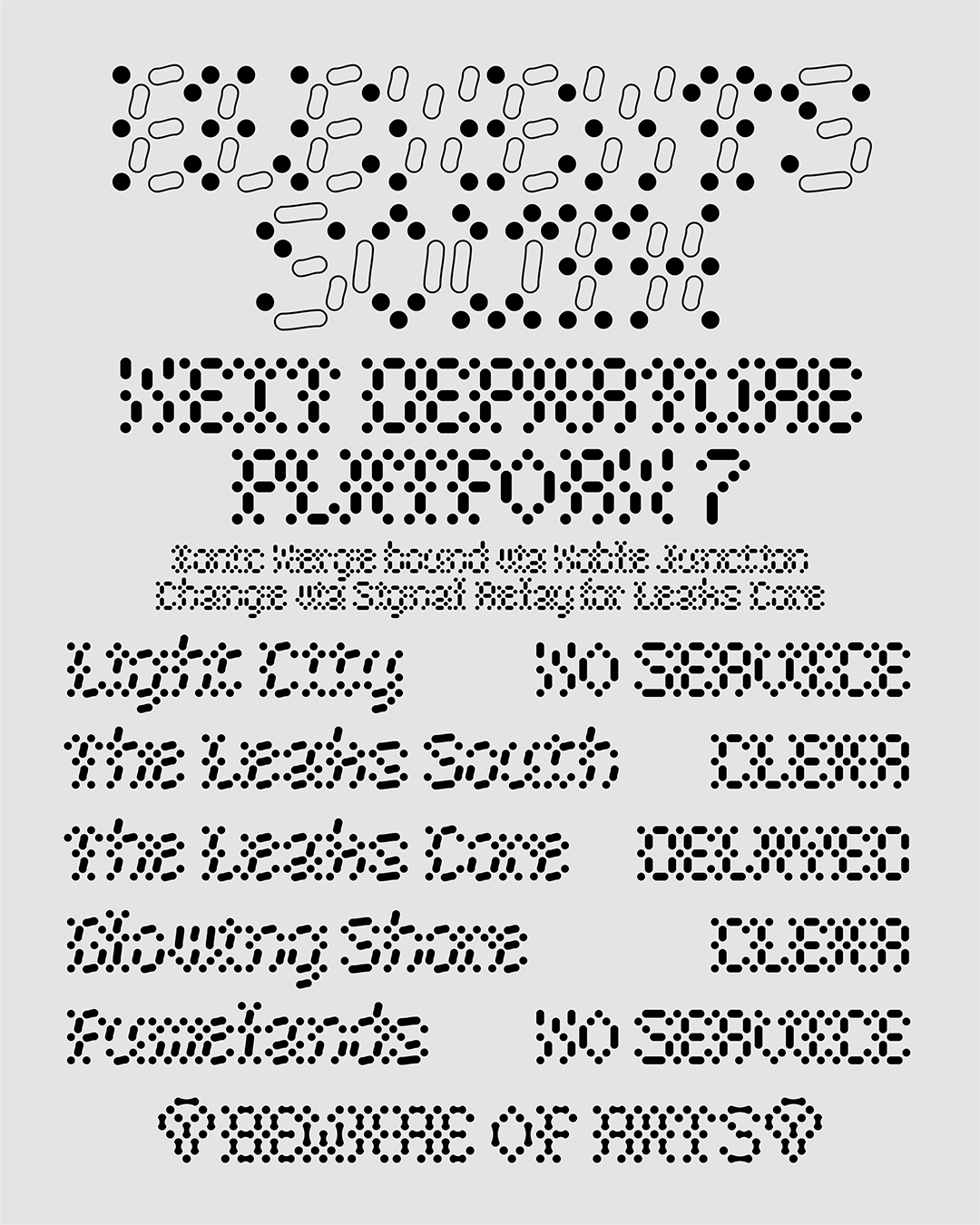
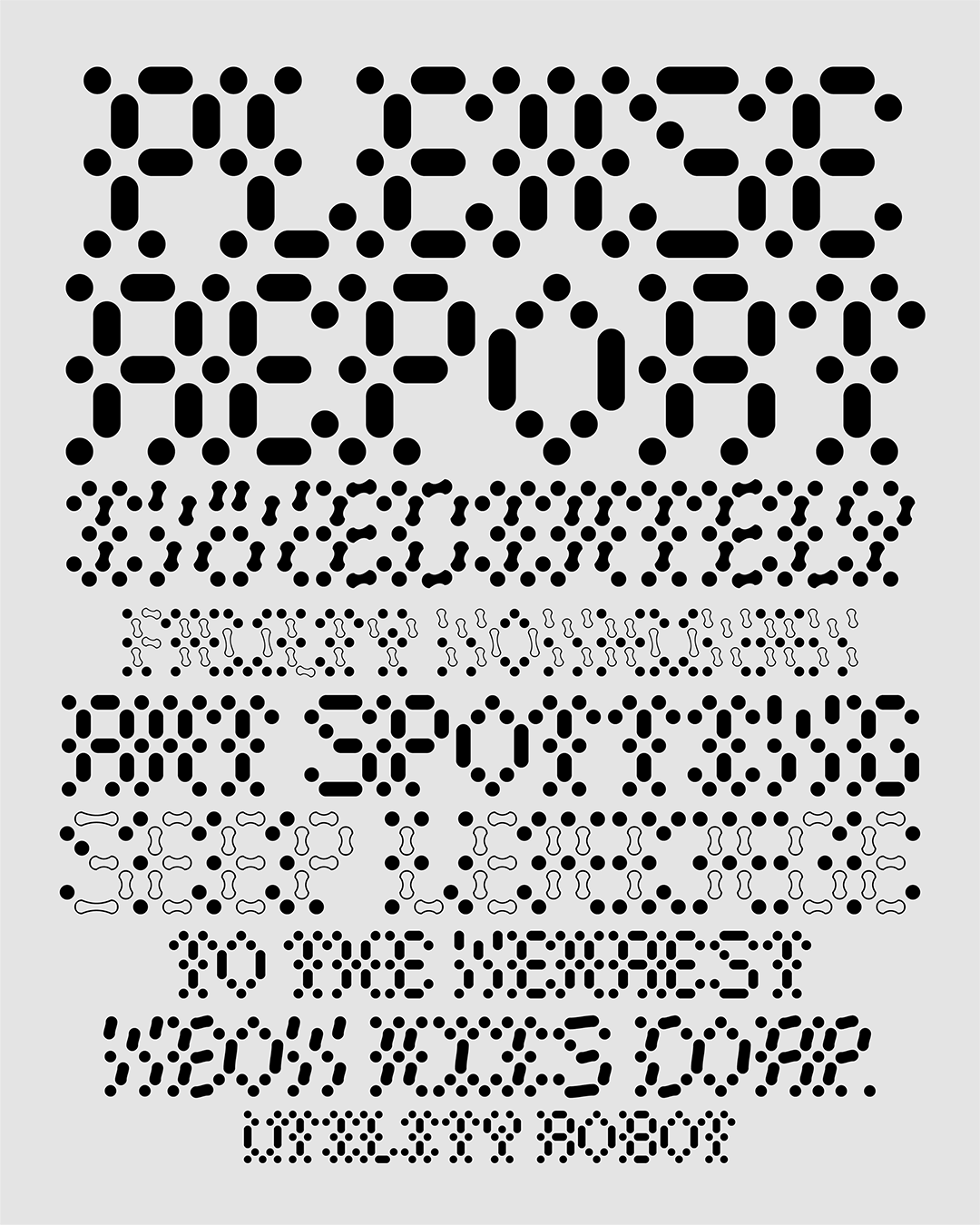
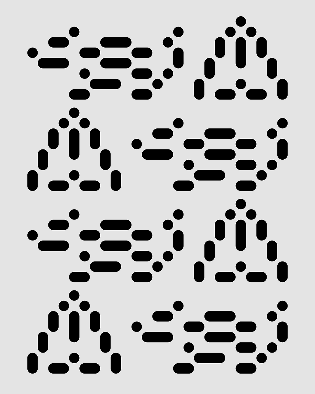
Ampoule is drawn with only three components of three different sizes: a dot, a rounded rectangle that is double the height of the dot, and a rounded rectangle that is triple the height of the dot, following a very strict matrix - the appearance of the dot is the only invariable. Ampoule is also an exercise in readability and legibility minimalism, the constraints and lack of space allowing for an interesting exploration of typographic forms. It turns out that Ampoule is more readable in very small size rather than very large, which could seem contradictory at first.
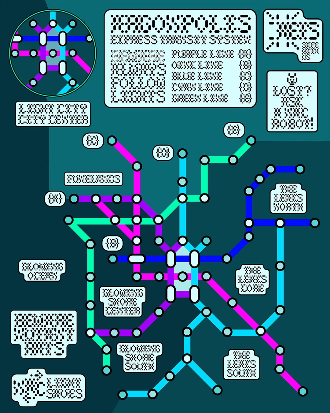
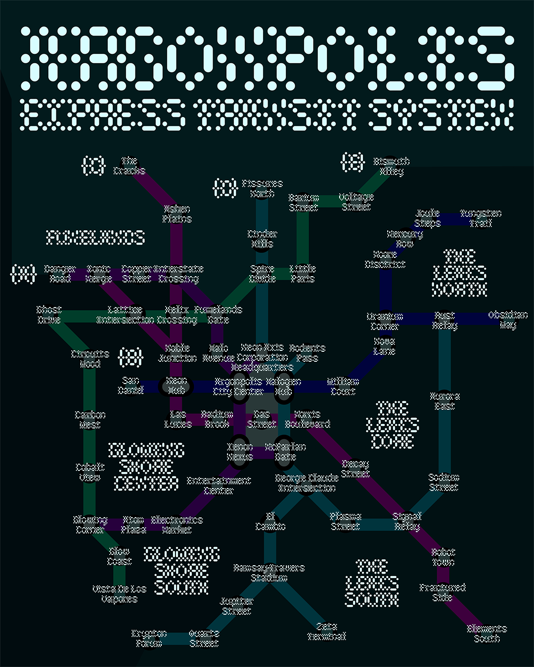
During its drawing process, it became clear to Ando that Ampoule deserved to exist in its own dystopian universe. She then imagined a world-building concept, contextualizing the typeface in a dark and dangerous future. Ampoule remains a typeface deeply inspired by the information boards of public transport systems, but this is far from being its only function. Its 100% component-based construction allows for endless graphic exploration, easily modifiable through the three basic components. Ampoule Playground offers some kickstart ideas. The 3D renders of Argonpolis have been done by Carla Manckoundia.
-
Daytona Mess
Paris, FR
1.0
This first public version contains the Neon and Rats styles, and their correspondent slanted, backslanted and Tube variants, and other surprises. The fonts of this version have 748 glyphs, including support for Latin-bases European languages and Vietnamese, as well as a collection of thematic icons and gender-inclusive ligatures for the French language.