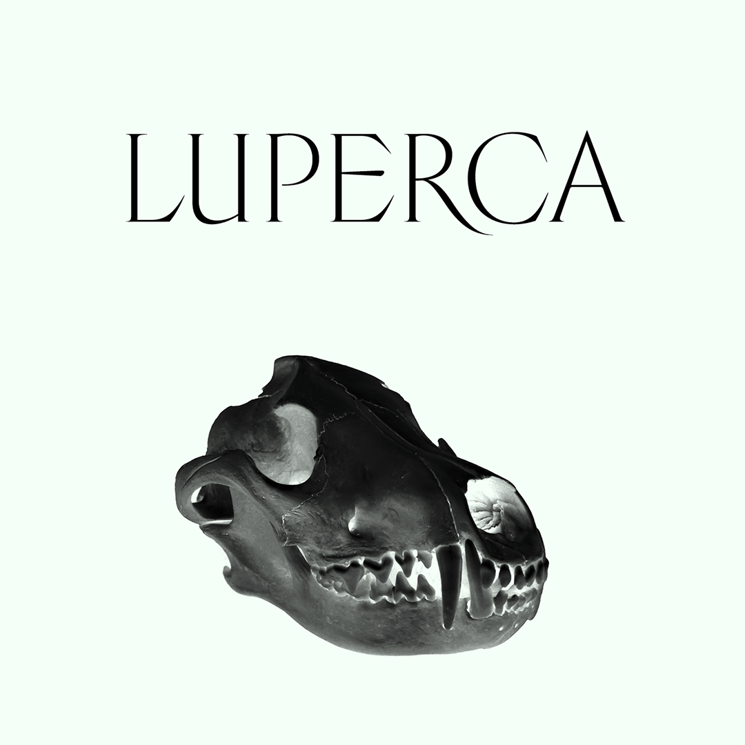
Luperca
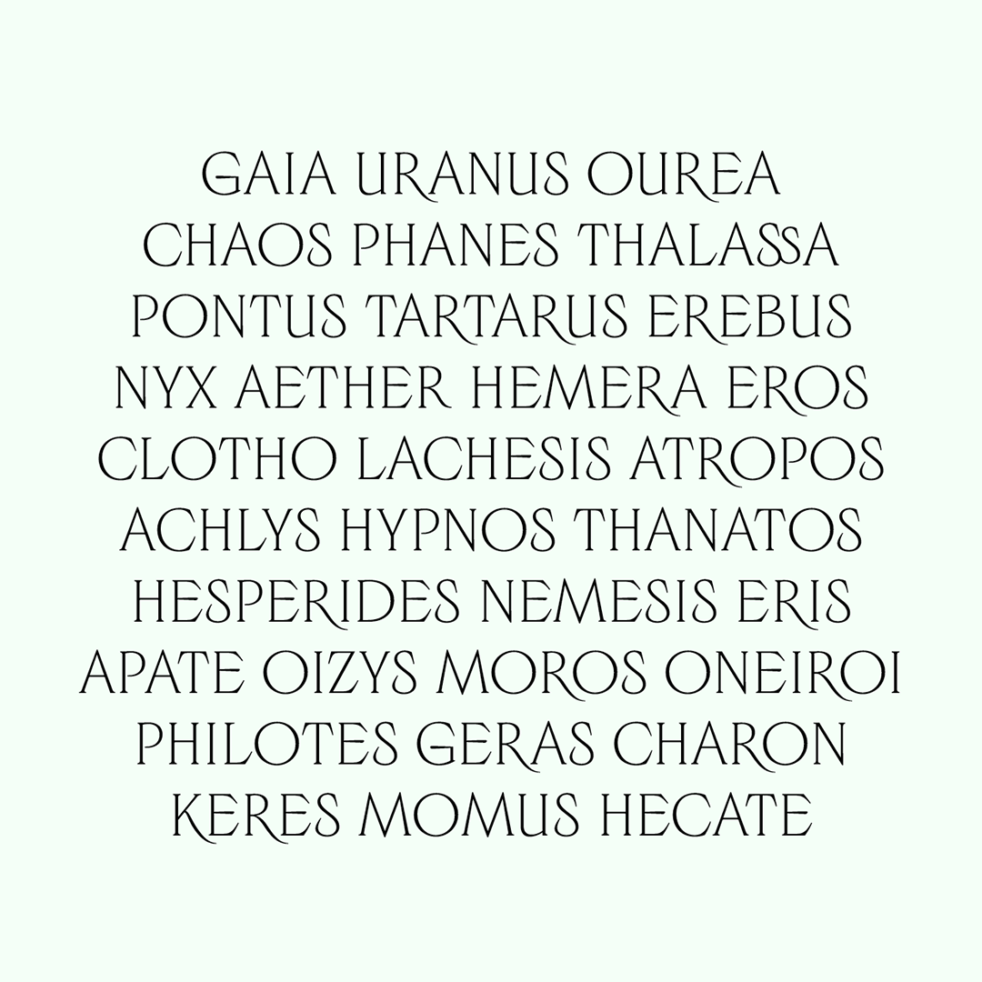
Luperca is a typeface that explores a possible evolution of Roman square capitals. It was originally designed for the 11th issue of the Cercle magazine, which was dedicated to mythology.
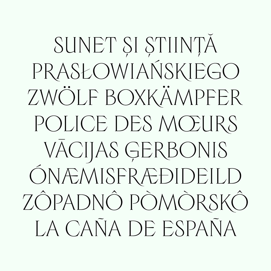
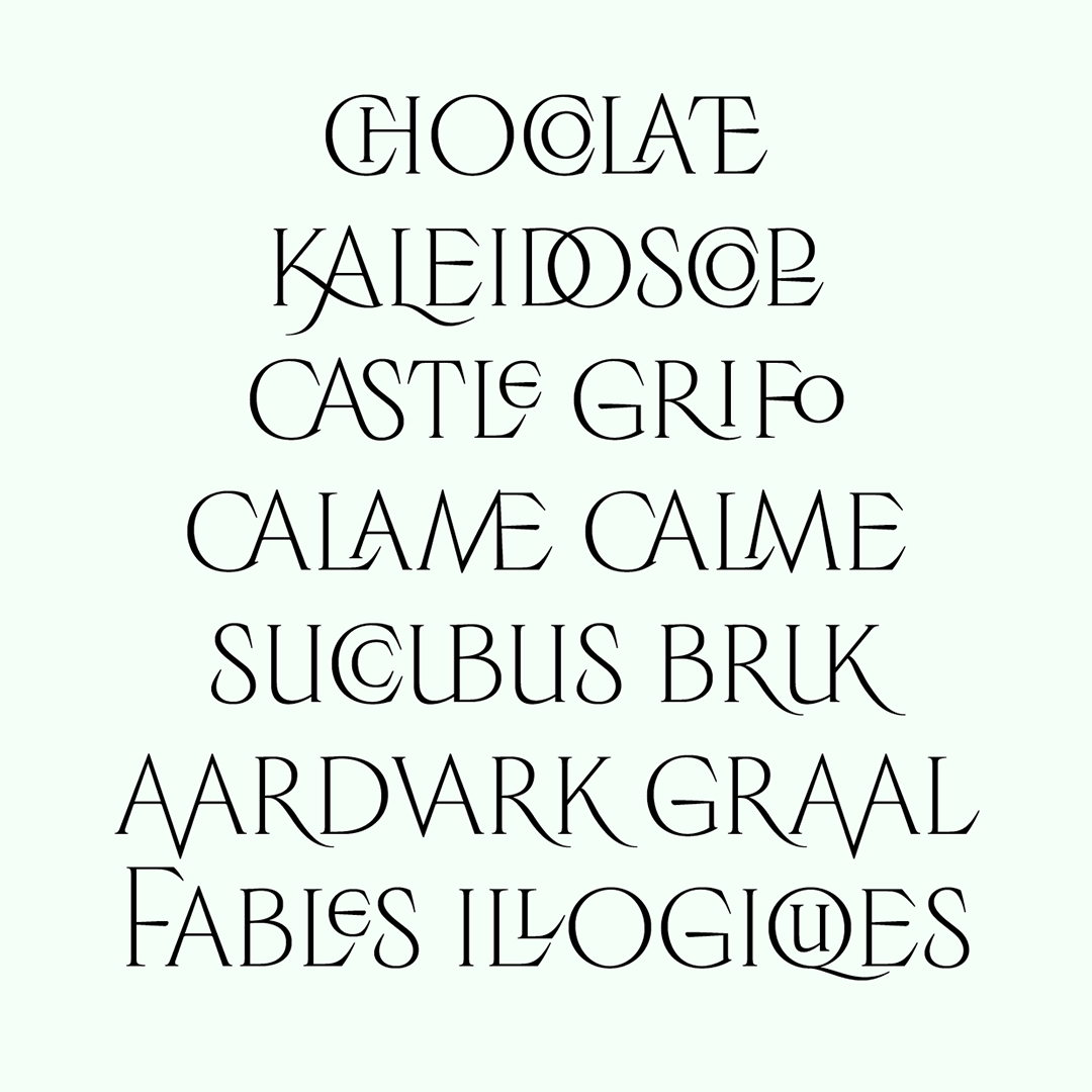
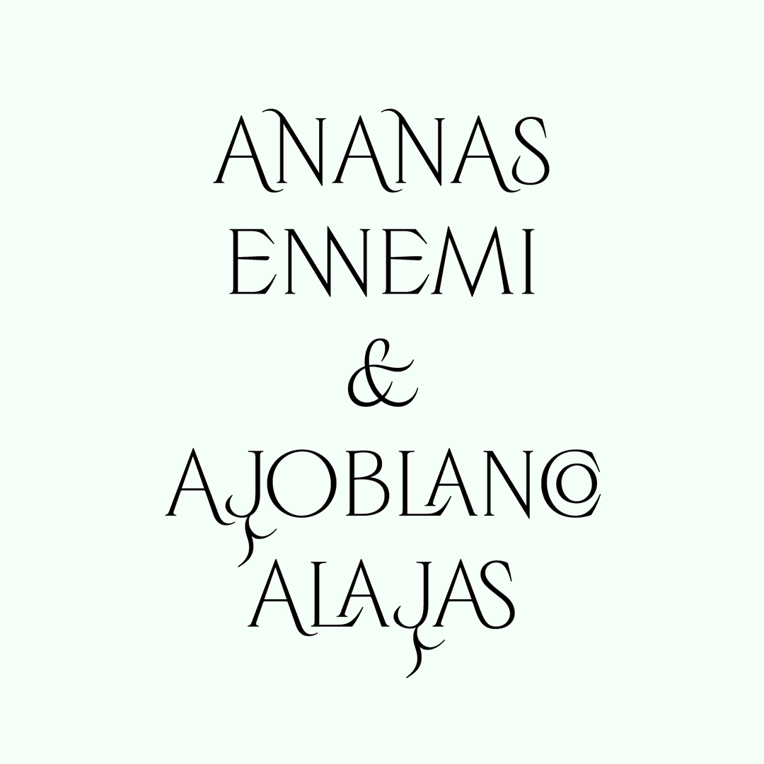
On the one hand, it collects epigraphic Latin shapes that were used to save space (ligatures, capitals that are higher than the cap height or lower than the baseline to create imbrications) and represents them in a digital format. In the context of a typeface dedicated to an editorial use, this graphic devices allow to compose titles that are more compact, in order to better compensate to the rather wide length of its letters.
On the other hand, it gathers a set of graphical structures that belong to different time periods and adds to them contemporary calligraphic details. For instance, the tail of the letter Q is inspired by the Lyon Tablet, and it confers the texture of the text a particular rythm. Other letters have serif which are inspired by the way the square capitals were engraved with a chisel. However, the bar of the letter E is based on the rotation of a calligraphic pen. In each part of this project the balance between calligraphy and typography, between drawn letter and engraved letter, has been considered. Luperca contains five optical display sizes.


-

Ariel Martín Pérez
Paris, FR
First uploaded version of Luperca, an all-caps font with one weight and five optical sizes.